Codes and conventions of a music magazine cover
-Most magazines have a one word or letter title
-Title in top left hand corner of the cover which is usually the full width of the page
-Date, price and barcode.
-Band or artist is the main image - Medium close-up which conveys an attitude
-Unique fonts, the largest text is on the cover
-Consistent colour scheme - not too many colours
-Image - Direct address - looking at the reader
-Main coverline anchors the meaning of the main image
-Coverline - Main coverline is two lines
Other coverlines - two or three lines
- information about contents
- intrigues the audience
-Typography is consistent, only a few fonts are used.
Main fonts are: SERIF or SANS SERIF
-Connotations of font reflect target audience and subject
-Positioning statement - by the title
-MASTHEAD:
Title
Positioning statement
Date
Price
-Puff - Something extra, usually free
-Buzzwords, i.e. EXCLUSIVE
-Strip at the bottom or top of cover - list of names, topics
Codes and conventions of magazine contents pages
-consistent font
-same colour scheme as front cover
-letters from the editor
-main image/one large image, also smaller images
-uses headings to divide up contents
-pages numbers on images anchor image to written contents
-collumns 2/3
arrangement:
pg.no text
one or two words
smaller sublines
-subscription details
-white background
-title of magazine is repeated
-issue date
-the word contents
-bottom of page-page number, title, issue date, website address
-contact details
PLANNING
cover+contents
PRODUCTION


Final Cover and Contents Page


Evaluation
My task was to be able to produce a school magazine and contents page which followed the codes and conventions of a normal magazine. To be able to do this I had to research the codes and conventions and then plan out how I could produce my magazine. I also looked at different music magazine front covers and contents pages that helped me to decide what regular content showed up in each magazine and what I should put in my magazine.
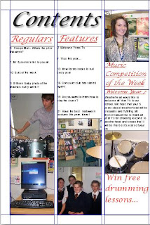
I think that I followed most of the codes of conventions of a magazine front cover because the title of my school magazine was only one word and was the full width of the page. The front cover contained the date, price and a barcode and also one main image which was a medium close-up. I think that my front cover would intrigue the audience which is students because it has bold writing that would catch your eye but also because the articles would also appeal to students. I also think that followed most of the codes and conventions of a contents page because I have consistent font and colour scheme which is also consitent on the front cover. I have created 3 different columns,used different headings to divide them up and left the background white which most contents pages are. At the top of the contents page I have written the word "contents" and I have added the page numbers onto the pictures.
But I havent followed all of the codes and conventions that should appear in the magazine. For the front cover I havent got a main coverline and I havent added a puff which would attract the target audience. I also havent added a strip at the bottoms of the page that should contain names or topics. For the contents pages I havent added a letter from the editor or added one main image, although I have alot of smaller images. On the contents page I havent added the subscription details or repeated the title of the magazine, also I should of added a website address and contact details.
To produce my front cover I used photoshop which enabled me add a drop shadow to my title and writing which made it more interesting. I was able to make the main image cover the whole of the front cover like most magazines. I think that using photoshop helped me produce my front cover the way I wanted to and had planned. To produce my contents page I used Quark Xpress which enabled me to produce even columns with headings to divide them up. I could also add pictures which were paired with my articles and add page numbers to them.
To improve my magazine front cover I could add coverlines which would would intrigue the audience that would anchor the main image. Used buzzwords and puffs that would of attracted the readers attention to want to look inside the magazine and make it look more interesting. The way that I could improve my contents page is to include a letter from the editor and use one main image instead of all smaller images. To make it look more like a content page I should add subscriptions and a website address at the bottom which all magazines have.
No comments:
Post a Comment